


Preview: Snapshot Analysis


Most of my Orb-related time and effort this offseason has been spent on bigger-picture impact such as onboarding our new members to the team. The NFL season feels like an 18-week sprint plus the playoffs so as nice as it’s been getting a breather, I’ve been itching to get back into the weeds on football data. Most of the analysis you see in the newsletter is based on our predictive models. It is focused on the Orb’s performance, as well as its picks for the upcoming weekend of football. What you don’t see a lot of is an analysis of what is happening around the league as a whole. This season I want to start running what I am calling ‘snapshot analysis’ which is data visualizations of some of the numbers behind each team in the league. One of my goals for this is for you to be able to form your own opinions on what may happen in the upcoming NFL weekend based on descriptive analytics, rather than just seeing which picks our models like. The plan right now is for the snapshot analysis to be for our paid subscribers as we are trying to increase the value of the subscription beyond just Thursday and Monday night picks.
Logo or player scatter plots are my favorite data visualizations for sports so this also feels like the perfect opportunity to explore some of our own. For this preview below, I am using data from the end of the last regular season, but going forward these graphs will be up to date as of the week they are run. As I post these throughout the season I hope to include less and less of my own written analysis so it is truly for you to help form your own opinions. But to start, I will include some written text so you see how I interpret each graph. Some of these graphs may be up for interpretation which is one of my favorite things about the world of data. It can be just as subjective as it can be objective. There is often a counterargument to every assumption. Depending on which information you find most interesting or useful, I can add or remove different graphs throughout the season but for now, I will play around with anything I find interesting or potentially useful. The data below is via a combination of pro-football-reference.com and our own record-keeping here at the Orb.
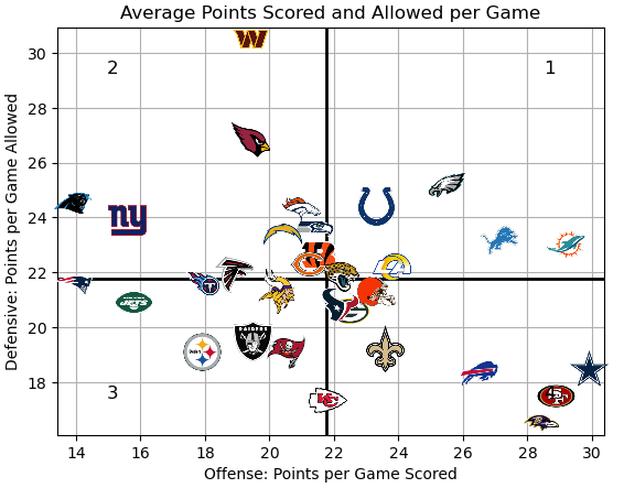
Figure 1
Quadrant 1: Score above league average/allow above league average
Quadrant 2: Score below league average/allow above league average
Quadrant 3: Score below league average/allow below league average
Quadrant 4: Score above league average/allow below league average
Analysis: Starting this off with a very basic graph. Figure 1 simply shows where each team fits in the league when comparing their points per game scored vs points per game allowed. The quadrant lines are based on league-wide averages. For this graph, you ideally want to see your team in quadrant 4, on the bottom right of the graph. These are teams that score more than the league average while allowing less than average points against. Based on last regular season, it is no surprise to see teams like the 49ers, Ravens, and the Cowboys here. Teams in the top right of the graph, quadrant 1, scored a lot of points and allowed their opponents to score a lot of points making for high-scoring fun games. While teams in the bottom left hand of the graph, quadrant 3, neither scored a lot nor allowed a lot of points making for more defensive games. Based on my memory of last season, the teams in each of these quadrants check out. Games that featured teams like the Dolphins and Lions were generally fun and high scoring while Raiders and Steelers games were often punt-fests. We no longer run models to predict the point over/under for games, but I know this is a popular bet type, and hopefully, information as simple as this could help you predict if a certain matchup will be high or low-scoring.
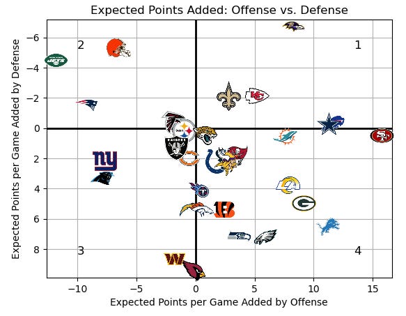
Figure 2
Quadrant 1: Good offense/good defense
Quadrant 2: Bad offense/good defense
Quadrant 3: Bad offense/bad defense
Quadrant 4: Good offense/bad defense
Analysis: Figure 2 is one layer deeper than what we saw in Figure 1. Here we have a similar comparison but using one of Pro Football Reference’s advanced stats ‘expected points.’ So for offense, the x-axis of our graph is the expected points added by a team’s offense. Here a good offense is represented by a high, positive number, while a bad offense is represented by a low, negative number with 0 being an average offense. For defense, the y-axis of our graph, it is flipped. So a good defense is represented by a low negative number, while a bad defense is represented by a high positive number with 0 being an average defense. For this reason, I have flipped the sign of the y-axis so the graph is more intuitive to read. Although I think the data community can get a little carried away with advanced stats from time to time, I do believe when calculated correctly, they tell a more accurate story than simple stats like points per game. For Figure 2, you ideally want to see your team in quadrant 1, on the top right of the graph. 4 out of the 5 teams with above-average offenses and defenses expected points added not only made the playoffs but won their divisions outright. The Saints are the outlier here, who tied for the best record in the NFC South with the Buccaneers but lost on tiebreakers. Based on this graph, they may be an undervalued team by the public heading into the 2024 season. One team to highlight the difference in their position on the first two graphs is the Browns. In Figure 1, looking at simply at points per game they are in the best quadrant and represent a team that scores an above-average amount of points. But using a more advanced stat like expected points we see that they were a below-average offense. This difference highlights the use case for advanced advanced stats and was the inspiration for Figure 3 below.
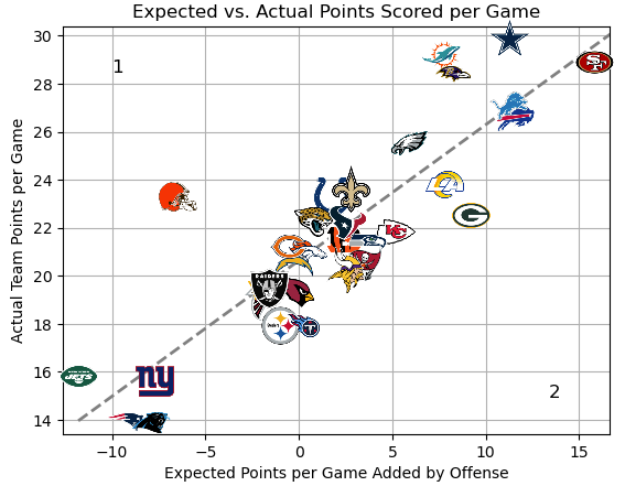
Figure 3
Side 1: ‘Overvalued’ Offenses
Side 2: ‘Undervalued’ Offenses
Analysis: The goal for Figure 3 (and Figure 4 below) is to try and use an advanced stat like expected points to beat public perception. Along with the ever-expanding database and modeling that odds-makers have, a big factor that goes into weekly spreads, moneyline odds, and point totals is the public perception of a team. When the public thinks a team is better than they actually are, they bet on them and Vegas takes their money more often than not. By comparing expected points to actual points scored, I hope that this graph can help beat the public perception of offenses. The purpose of this graph is to find outliers. A team being close to the dashed line means they scored about as much as they ‘should’ have based on their expected points added. Yes, some of these points may come from defensive or special teams touchdowns, but as we know these can help add to the public perception of a team and aren’t consistent methods of scoring that you can count on each week. Being far away from the line on the left side of the graph represents an offense that the public may “overvalue” or “overhype.” Being far away from the line on the right side of the graph represents an offense that the public may “undervalue” or “underhype” according to the advanced stat. I am not trying to single out the Browns so I apologize to any Cleveland fans, but they are the biggest outlier on our graph from last season. They averaged 23.3 points per game, but their offense added -6.5 points per game meaning they were well below average on that side of the ball. Following their placement on the chart, they performed more like a 17-point-per-game offense. We saw this play out in real-time in the playoffs when the offense severely struggled against the Texans, putting up just 14 points in their first-round loss to Houston. Similarly, even good offenses with positive expected points added can be ‘overrated.’ The Dolphins found themselves outscoring their expected points in the regular season as the team that averaged 29.2 PPG put up just 7 points in their first-round loss in the freezing cold of Kansas City.
On the other side of the dashed line in zone 2, we look for outliers that may be ‘underrated’ by the public. The Packers averaged just 22.5 points per game in the regular season but their advanced stat suggested there may be more to this offense than meets the eye. We then saw them upset the Cowboys in Dallas scoring 48 points, albeit some off of turnovers. We also see that the Chiefs’ offense, which was lightly scrutinized throughout last season for not playing up to their potential, had better advanced stats than what we saw on the scoreboard. We then saw them pick up their level in the playoffs on the road to another Super Bowl.
I don’t expect this graph to be perfect, especially early on in the season when team data is so reactionary. But I think it's a worthwhile effort to see if we can use an advanced stat to try and see through public perception.
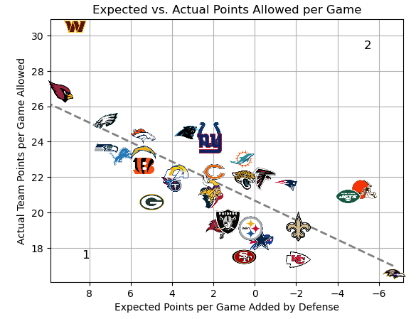
Figure 4
Side 1: Overvalued Defenses
Side 2: Undervalued Defenses
Analysis: Figure 4 is the same as Figure 3 but looking at the defensive side of the ball. Here, teams significantly below the line are defenses that may be ‘overhyped’ by the public while teams significantly above the line on side 2 may be better than the public thinks. The 49ers are a defense that we saw this play out with in the playoffs. I too am guilty of seeing the San Francisco uniform and assuming they have a world-class defense. And to be fair, they only allowed 17.5 points per game in the regular season. But here the expected points tell us that they were closer to a 21-point-per-game defense, like that of Houston or Minnesota. After their first-round bye, we saw the 49ers’ defense struggle to get stops in the playoffs, allowing 25.6 points per game in their three playoff matchups.
Teams above the line on side 2 are defenses that might be underperforming what they ‘should’ allow. While the Commanders were a terrible defense no matter how you look at them, according to this data, they played more like a 25 PPG defense rather than a league-last 30.5. Again, there are always exceptions and these charts won't be perfect. We saw the Browns’ defense get torn apart in their Wild Card matchup against Houston which goes against what we would expect here. But out of all the snapshot graphs, I believe Figured 3 and 4 have the potential to be the most valuable if they work as we hope they will.
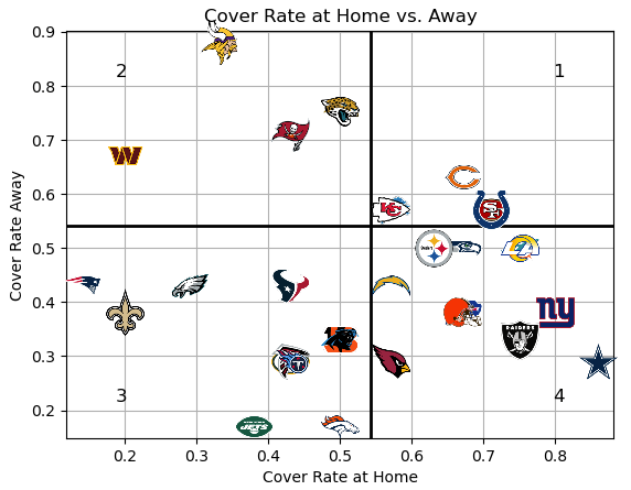
Figure 5
Quadrant 1: Cover the spread at home and on the road
Quadrant 2: Don’t cover the spread at home, cover on the road
Quadrant 3: Don’t cover home or on the road
Quadrant 4: Cover the spread at home, don’t cover on the road
Analysis: I was curious how each team performed at home compared to on the road against Vegas’ lines. The bold quadrant lines here represent the 52.4% profitability cover rate. In line with the graphs above, you ideally want to see your team in the top right quadrant here. These five teams had a profitable cover rate between weeks 2-16 both at home and on the road. Regardless of where they were playing, if you took them to cover chances are you won your bet. Diagonally across from them are teams that hopefully you bet against last season more often than not. These are teams that had no real home-field advantage and also were not able to trouble opponents on the road against the spread. The remaining two quadrants are the most interesting to me. All season I heard that Dallas was only good at home and it turns out that the data backs up these claims. When they played in Jerry World you could almost cash out your Cowboys spread pick before you placed it. But when playing away from home, they couldn't keep it close as underdogs or run away with the game as favorites. The flip side of this performance was the Vikings. I was shocked to see their position in my analysis as I hadn’t heard or noticed anything unusual about them during the season. They were not able to win home betters any money this season but had the best cover rate on the road in the entire league. Of the four games in which they were underdogs on the road, the Vikings lost outright yet covered the spread in three of them, making them the first-ever ‘Orb Baker Team of the Year’ winners. Hopefully, that honor helps cheer up any Minnasoda fans we have after the off-season departure of quarterback Kirk Cousins.
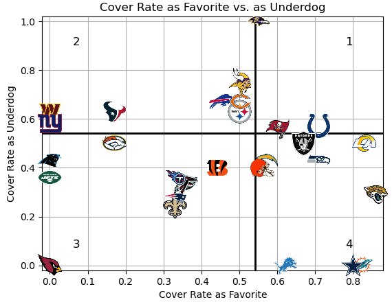
Figure 6
Quadrant 1: Cover the spread as favorite and underdog
Quadrant 2: Don’t cover as favorite, cover as underdog
Quadrant 3: Don’t cover as favorite or underdog
Quadrant 4: Cover the spread as favorite, don’t cover as underdog
Analysis: Finally, the other way I wanted to break down the overall cover rate was by which side of the line each team was. To qualify to be on this graph, a team must have been both a betting favorite and an underdog between the weeks of 2-16. Meaning the 49ers and Chiefs are not included as they were never given points by Vegas in this stretch of the season. The Cardinals and Panthers are also not included as neither team was a favorite against the spread. Only the Ravens, Buccaneers, and Colts were profitable regardless of what Vegas expected. While Baltimore makes sense based on what the eye test told us this season, I was admittedly surprised to see the other two teams in this quadrant. However, looking back on this year both teams surpassed my expectations of them so maybe this reflects the impact public perception has on betting lines. The remaining emptiness of Quadrant 1 is a visualization of how good the odds-makers are at their jobs and how much of an uphill battle we fight each season here at the Orb. You’ll notice that the other 25 eligible teams were not profitable on at least one side of the favorite/underdog line. Vegas is not in the business of losing money, and once again, it did a great job of making it tough to find a winning overall trend. The next group that I have to talk about is in the bottom right-hand section which I am labeling ‘frauds.’ Now before any fans get upset, to be considered fraudulent you have to be a good team. As you can see, the Lions, Cowboys, and Dolphins all had fantastic cover rates as favorites. Meaning when the oddsmakers considered them the better team, they won most of their games handily. However, all three combined to cover zero (0) of the games in which Vegas determined they were playing a better team during this stretch. So these three teams unfortunately get labeled as fraudulent meaning they were good teams that couldn’t hold their own when the lights got bright. The Jaguars could also be logically included in this list based on their position, but I don’t think this tells the full story. Jacksonville had back-to-back games abroad last season which skewed our data slightly. The betting lines and designation of the home vs. away team were irregular during this stretch. Regardless, they earned the highest cover rate as a favorite during this stretch of the season, yet covered as the underdog just 29% of the time.
The plan is to run this analysis either weekly or bi-weekly depending on how much change we see in the numbers week to week. If I find more interesting numbers to run or any of these start to become noticeably less valuable than I hope they do I will start adding/dropping different visualizations. Hope you enjoy seeing data from around the league instead of focusing on just the models and their predictions. Can’t wait for kickoff!
Presenting Sponsor

Fantasy Football season is coming up which means one thing: the draft is coming. What if there was a way to play fantasy football where every week was as exciting as draft week? And we don’t mean daily fantasy, this is a brand new way to play with all your friends in one league for a full season. KART Fantasy Sports has completely remade Fantasy Football focusing on what players love about the game. We’ve added brand new mechanics that make trading easier and more like real-world sports trades, roster mechanics that make you have to make real decisions every single week, and systems to make sure everyone stays competitive all season. No more players dropping out mid-season! If you love fantasy football but have always wanted more, you have to try KART Fantasy Sports this year!
If you want to try out the best way to play fantasy football this season, email kartfantasysports@gmail.com or use the sign-up link here today!
-Team Orb Analytics Limited
.
.
.
.
.
.
DISCLAIMER:
The information provided on this website is for informational purposes only. It is not intended to be gambling or financial advice, and should not be relied upon as such. We are not responsible for any actions or decisions taken by readers based on the information provided on this website.
The picks and predictions provided on this website are based on our own research and analysis and are intended to be used for entertainment and informational purposes only. We do not guarantee the accuracy or completeness of the information provided, and we are not responsible for any losses or damages incurred as a result of using this information for gambling or other purposes.
By accessing and using this website, you acknowledge and agree to the terms of this disclaimer, and you assume all risks and liabilities associated with your use of the information provided on this website.
Love this idea! Counting down the days until the season starts...